Plots how the tension rises and falls across your manuscript, chapter by chapter. A good arc usually builds gradually with a steep climb near the climax.
What it measures
For each chapter, the analyzer estimates on-page tension from four independent signals: action density (verbs of physical movement, confrontation, urgent decision-making per 100 words), dialogue-to-narration ratio (dialogue-heavy chapters read as faster; long narration stretches read as slower), average sentence length (short sentences carry higher pace), and the presence of stakes markers — words and phrases like "must", "fatal", "before", "unless", "the last", "one chance", "if he didn't". These roll into a single tension score per chapter, typically on a 0–10 or 0–100 scale depending on the length of the book, and get plotted as a chapter-numbered curve.
The overall shape gets characterized by a mean tension number (the arithmetic average across all chapters) and, implicitly, by how much variation exists between adjacent chapters — the same "pacing cv" surfaced by Story scorecard. A healthy pacing arc for popular fiction usually shows a rising trend from left to right, with distinct peaks around each act break (roughly the 25%, 50%, 75%, and 95% points) and a single dominant peak in the final quarter that resolves in the last chapter or two.
The report doesn't claim to know your genre's expected shape — a thriller and a literary novel produce very different-looking curves and both can be excellent. What it does is give you the shape you actually have, which is often surprisingly different from the shape you thought you were writing.
Why it's useful
Books are hard to feel at book length. You know a chapter is good; you know a scene is tense; but the overall arc — whether the second act sags, whether the climax lands higher than the setup, whether the trough between two peaks reads as a "false climax" — is nearly impossible to hold in your head at once. This is the one report that gives you the shape of the whole thing on one screen.
Middle-book sag is instantly visible. The classic pattern is a rising first quarter, a plateau or dip through chapters 6–12, and then a scramble back up in the final third. If your curve shows that plateau, you know where to spend your revision energy — you don't need to guess. A climax that's actually lower than the mid-book set piece is also instantly visible: the peak is in the wrong place, and the reader will feel let down.
Two peaks with a trough between them (a "false climax") shows up as an unmistakable double hump — often a sign that you're building to something in the middle that overshadows your intended ending. That's usually a structural revision, not a line-editing one.
Read this alongside Story scorecard (the same signal reduced to a coefficient of variation plus explicit "pace shift" flags) and Semantic arc (the thematic-not-tension version of the same curve idea). Pacing arc is the visual entry point; the other two give you the reduced, quantitative view.
How to read it
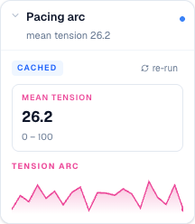
The card opens with a single mean tension stat tile in pink, printed to one decimal (e.g. "5.6") with the range "0 – 100" as a hint below. Underneath is a Tension arc section labeled in pink, containing an SVG sparkline: a smooth line connecting one point per chapter along the x-axis (left = chapter 1, right = final chapter). Below the line the sparkline shades in with a soft pink gradient that fades toward the bottom, and the last point is marked with a solid dot so you can always find where the curve ends.
Peaks in the curve are tension climbs; valleys are quiet chapters. Read it left-to-right as if you were reading the book: a rising overall trend with clear peaks at what should be act breaks and one dominant peak near the end is the target shape. Where the curve dips unexpectedly, expand the Story scorecard card in the same panel to see whether that chapter also flagged as a "sudden stall" — the two reports often agree, and the scorecard adds the direction of the shift.
The collapsed card summary in the reports rail shows just the mean tension, so you can see the overall pacing signal at a glance from the panel without expanding. When you spot an unwelcome flat stretch or a valley in the wrong place, that's your revision assignment: raise the stakes markers, cut narration to bring up dialogue ratio, shorten sentences, add a decision or reversal in the middle of the chapter. Re-run the report after your changes and the curve should move visibly.
When to ignore it
Literary fiction that holds a quiet, sustained tone throughout on purpose will look flat, and that's fine if it's what you intended. A domestic novel where the biggest event is an argument at a dinner party doesn't need the same kind of act-break peaks a thriller does. The useful comparison is against a book in your genre — mentally sketch the curve you'd expect from Beloved or Never Let Me Go or whatever your closest reference is, and check whether your curve is in the same territory.
Short-story collections and essay collections produce a spiky, chapter-independent curve because each piece is its own arc — the report is basically not the right tool for those. Books with multiple POVs on unrelated storylines can also produce misleading curves because chapters aren't in narrative sequence in the tension sense; a quiet POV chapter juxtaposed with a loud one reads as a stall, even when the two are meant to be running in parallel.
Very short manuscripts (under 6–8 chapters) don't have enough data points for the curve to be readable; wait until you're at chapter-count. And any manuscript still in first-draft with placeholder chapters or missing scenes will produce a jagged curve that reflects incomplete work, not real pacing — the report is diagnostic on complete drafts, aspirational on drafts in progress.
How to run it
- Click Write in the left sidebar and open the document you want to analyze.
- Open the right-side rail: click the Reports button in the editor's top toolbar (the bar-chart icon).
- In the rail header, click the Reports tab.
- Scroll to the Pacing arc card under the Structural heading.
- Click the card to expand it. First-time runs take 5–20 seconds; a spinner in the header shows while the LLM streams. Cached results render instantly. Use re-run to recompute after a heavy revision.
- The card renders a chapter-by-chapter tension curve as vertical bars ("Ch 1 → Ch N" along the x-axis). Higher bars mean higher tension. The collapsed card summary shows the mean tension score.
What to read next
- Narrative Flow — the standalone deep-dive page for pacing analysis
- Semantic arc — how themes shift across the book (a different curve)
- Reports — back to the panel overview