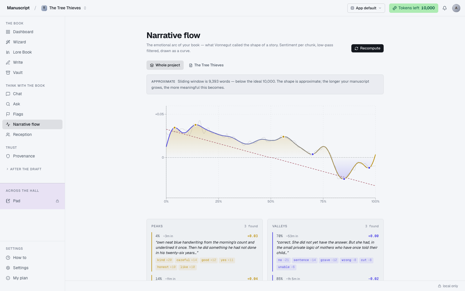
What Narrative Flow shows you
Narrative Flow is a visual read of your book's emotional arc — what Kurt Vonnegut called the "shape of a story." It plots the sentiment of your prose across the full length of the manuscript, drawing a curve that rises when the writing warms and hopeful, dips when it turns cold and hostile, and lets you see the macro pattern that's hidden inside 60,000 words of prose.
You use it to see the shape of what you've written. Books are hard to feel at book-length; a chapter can feel taut on its own but sit in the middle of three consecutive warm plateaus and drag the whole section down. The visual makes that visible in a way rereading can't — the curve is the shape of your book's mood over time, laid flat on a single page.
All the math runs in your browser. The chart is computed locally — no LLM calls, no server-side analysis, no tokens spent. The AFINN sentiment dictionary scores each windowed chunk of your prose (positive words add, negative words subtract), then a low-pass Fourier filter smooths the raw signal down to the macro arc. A short manuscript resolves in a second or two; a 90k-word draft takes a few seconds. There's no cost and no rate limit — recompute as often as you want.
Because it's local, Narrative Flow auto-runs the moment you land on the page. You don't press anything to see the first read; the chart is there when the page finishes loading. Recompute lives in the top-right as Recompute and re-runs the math against your current draft state.
How to read the chart
The x-axis is book position from 0% to 100% — the start of the manuscript is on the left, the end is on the right. The y-axis is sentiment: above the zero line is warm/hopeful/connected (drawn as an ochre wash and line), below the zero line is cold/hostile/lost (drawn as an indigo wash). The zero line itself is dashed, so you can tell at a glance which side of the emotional split each section sits on.
Two lines are drawn on top of each other. The faint gray line behind is the raw signal — sentiment scored per window, unfiltered. The thick colored line in front is the smoothed macro arc — the same signal after the Fourier low-pass, which strips out chunk-to-chunk noise so you can see the structural shape.
Ochre dots mark the top peaks; indigo dots mark the top valleys. These are the strongest moments in the smoothed arc — the warmest highs and coldest lows the book reaches. Hover any point on the curve for a tooltip that shows the exact percent position, the chunk number, the word count of that window, a preview of the actual prose ("...the lantern went out and she was alone with the sound of the sea..."), and both the raw and smoothed scores.
If you've set up an Outline with act and chapter boundaries, faint vertical dashed lines mark the transitions on the chart. This lets you see whether your Act 2 midpoint actually sits where the emotional midpoint of the book is, or whether the book's felt-midpoint is somewhere else entirely.
A well-shaped book usually has a rising overall arc with clear peaks near the end of each act and one big peak (or crash) at the climax. A book that plateaus in the middle third often has a middle-book problem. A book that peaks early and never recovers usually needs its climax rewritten to land harder than the setup. None of this is prescriptive — some books hold quiet for their whole length on purpose. The chart shows you the pattern; you decide whether it's the pattern you wanted.
Running the analysis
The first analysis runs automatically on page load — you don't have to click anything. While the math is running (in your browser, no LLM call), the page shows "Reading the book, scoring each chunk, smoothing the curve…" as a placeholder. When it finishes, the chart takes over.
Above the chart, a scope selector row lets you choose which text is being analyzed. Whole project (the default, marked with a layers icon) reads every document in outline order and treats them as one continuous manuscript — this is the read you want for the book-level shape. Each individual document also appears as its own pill in the row; click a document pill to scope the analysis to that single file, useful when you want to see a specific chapter's arc without the surrounding book. The active scope is filled in the active-row color; the others sit as ghost buttons.
Recompute at any time by clicking Recompute in the top-right (it's just a re-run of the local math — no cost, no delay). Do this after you've done a substantial revision and want to see whether the shape changed. Small edits won't shift the smoothed arc meaningfully, so you don't need to recompute after every session.
If the sample is too small to be meaningful, a reliability banner appears above the chart. "Approximate" means the arc is real but noisy; "Exploratory" means the sample is small enough that the shape is unreliable. Write more, or narrow the scope to a document with more prose in it, and the reliability climbs.
Chapter details
Below the chart, two side-by-side panels — Peaks and Valleys — list the top three warm moments and the top three cold moments the smoothed arc reaches. Each moment shows its percent position through the book, a rough "how far into the read time" figure (e.g. "~1h 20m in"), the smoothed score, a short italic excerpt from that chunk of prose, and — this is the useful part — the specific AFINN dictionary words that drove the score, each with its individual sentiment weight (e.g. died -3, broken -2, alone -3). This lets you jump from "the curve dips at 90%" to "ah, it's that scene with the words 'died, broken, alone'" in one glance.
Underneath the moments, the Vonnegut shape panel classifies your arc against six canonical story shapes drawn from the arXiv:1606.07772 paper The emotional arcs of stories are dominated by six basic shapes (Reagan et al., 2016) — Rags to riches, Riches to rags, Man in a hole, Icarus, Cinderella, Oedipus. The panel tells you which shape your book most closely matches with a one-liner ("Your book's arc reads like Man in a hole — a fall into darkness that ends in recovery"), followed by a grid of tiles showing all six shapes with their correlation scores. Tap any shape tile to ghost that template onto your chart as a dashed crimson line, so you can visually compare your arc to the canonical one side-by-side. The best-matched shape is pre-selected on load if its correlation is high enough to be meaningful.
If your arc doesn't cleanly match any canonical shape, the panel says so ("Your arc doesn't cleanly match any canonical shape yet — either the manuscript is too short, or you're writing something the canon doesn't have a name for"). That's not a failure; it's information.
Below the shape panel, a small stats row gives you the numeric context: Source (project or document title), Total words, Read time (an estimated total read time at ~250wpm), Sample (how many chunks the analysis broke your book into, and how many words per chunk), Volatility (a numeric measure of how much the arc bounces — labeled "steady", "even pace", "kinetic", or "whiplash" depending on the value), and Range (the low and high of the smoothed arc). Volatility is a useful diagnostic on its own: a very low value means the book is emotionally flat, a very high value means it whiplashes between peaks and valleys — read the number against your intent.
What Narrative Flow is not
- Not a scoreboard. The absolute sentiment numbers aren't meaningful — a book scoring +0.10 isn't "worse" than one scoring +0.15. The shape is what matters, not the magnitude.
- Not prescriptive. Some literary novels hold quiet on purpose. Some experimental books zigzag deliberately. Read the chart against your intent, not against a template.
- Not a continuity check. For contradictions and setups without payoffs, run Flags.
- Not a reader response. For how actual (fictional) readers react, see Deep Analysis.
- Not an AI read. It's dictionary sentiment analysis with a Fourier filter, both running in your browser. There is no LLM involved. The upside is that it's free and instant; the tradeoff is that it can't understand irony, subtext, or context — a sarcastic "wonderful" scores as positive because the word "wonderful" is positive in the AFINN dictionary.
Using it with Flags and Deep Analysis
The three diagnostic surfaces sit in a rough order of cost and depth:
- Flags — mid-pass, medium cost. Catches contradictions, missed setups, over-repeated images. LLM-powered.
- Narrative Flow — free, instant, local. Shows you the shape of the book without spending anything.
- Deep Analysis — final pass, expensive ($55 + ~100k tokens). Simulates how 100 readers respond across five days.
Most authors run Narrative Flow constantly (it's free), run Flags after every major revision, and run Deep Analysis at most once or twice on a manuscript — near the end, when they're close to a query-letter draft.
Voice fingerprint and Narrative Flow
Voice fingerprint is not injected into Narrative Flow. There's no LLM to inject into — the analysis is pure dictionary sentiment + Fourier math. It's reading for tension shape, not writing anything.
How to use it
- Click Narrative flow in the left sidebar under "Think with the book". The page auto-runs an analysis of your whole project on first load — no button-press needed for the initial read.
- While the math runs (in your browser — no LLM call, no token cost), the page shows "Reading the book, scoring each chunk, smoothing the curve…". A short manuscript resolves in a second or two; a 90k-word draft takes a few seconds.
- Above the chart, choose a scope: Whole project (all documents in outline order) is the default, or click any specific document chip to scope to that one file.
- Read the curve. The x-axis is book position 0–100%; the y-axis is sentiment (warm/hopeful above zero in ochre, cold/hostile below in indigo). The faint grey line is the raw signal; the thick colored line is the smoothed macro arc. Ochre dots mark top peaks, indigo dots mark top valleys. Hover any point for the excerpt, raw and smoothed scores, and word position.
- Below the chart, the Vonnegut shape panel tells you which of the six canonical arcs your book most closely matches (e.g. "Your book's arc reads like Man in a hole"). Tap any shape tile to ghost that template onto your curve as a dashed crimson line for side-by-side comparison.
- The Peaks and Valleys columns list the top moments with the AFINN words that drove each score — click through to spot which scene contains the phrase "died, broken, alone" or "laughed, kissed, home".
- If a reliability banner appears at the top ("Exploratory" or "Approximate"), the sample is small — write more or narrow scope and the curve becomes meaningful. To re-run after edits, click Recompute in the top-right.
What to read next
- Flags — the cheap continuity pass
- Deep Analysis — the deep, paid read
- Provenance — the record of what's yours and what's the AI's